
St. Joseph the Worker icon
In honour of the 100th anniversary of the Archdiocese, iconographer Andre Prevost was commissioned to write a new icon of our patron saint. Here are some reflections on this prayerful work, in the iconographer’s words:
Artist’s Commentary
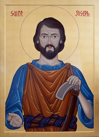
It has been a great blessing to write the icon of St. Joseph the Worker. Most icons to date which bear the name of St. Joseph the Worker are traditional portrayals of St. Joseph with the Christ Child, wearing the himation (outer garment) and usually holding the flowering staff or holding a set square (as a representation of his carpentry).
St. Joseph is portrayed in his middle years, in this new icon, wearing a pale blue tunic with rolled up sleeves and a leather earth-toned shop apron, which is buttoned at the shoulder. He is presented in ‘working’ clothes and not wearing the traditional himation, which would not be worn while working. The tradition of use of blue (or purple) for the inner garment represents the spiritual, and the outer garment is in warm brown colours for the earth. The blue in the detailing on his waist sash represents that St. Joseph was from the lineage of the House of David. His left hand rests on a wood-chipping tool and reaches out with his right, inviting people to himself.
Referenced to the Byzantine Tradition, the design is such for a stronger focus on St. Joseph’s title.
It was important to His Grace Archbishop Richard Smith that the icon be a reminder to us to be open to the working of God in our lives, and an invitation to us to trust in what God is doing, as Joseph did. “It also would be consonant with the traditional admonition of the Church “Ite ad Joseph” (Go to Joseph) to seek the intercession of the patron saint of the universal Church.”
An icon is referred to as having being ‘written’ and not ‘painted.’ This is because it is not associated to the fine arts: it isn’t about artistic creation but about tradition, unchanging guidelines and the iconographic theology that sees an icon as sacramental and in the same light as the written Word. An icon is not just an image to be looked upon, but connects with the viewer and draws he/she into itself and directly to its prototype (in this case, St. Joseph) and through it, to God’s saving grace.
The process for each icon is a journey for the iconographer; certainly one of patience as an icon will take the time that it requires. Every step is deeply set within tradition and rich in symbolism, guiding the spiritual journey. It begins with the wood panel, the symbol of the Tree of Knowledge (Garden of Eden) and the Tree of Life (the Cross). This icon is constructed in solid poplar and has two parts: the outer part ‘container’ (the raised frame area) and the inner part ‘the contained’ (the inset area); also symbolizing the two natures of the human being – the body and the soul. (You will note that it also has extra braces along the back of the icon to help prevent the natural warping of wood over time.)
The board is covered with linen cloth, which symbolizes the ‘Shroud’, dying to ourselves to enter the Kingdom. Aside from the practical preparation of the panel to receive paint, the white gesso symbolizes light creating a new room for beauty.
After the image is transferred on the panel, the Bole (a red clay base) is then applied to the sides and also to the front surfaces where the gold leafing will be adhered to – representing our nature in God’s Creation. It symbolizes the ‘old humanity’; the clay in the inner surface (under the gilding) symbolizes the ‘new humanity’.
The 24K gold background is the prime symbol. Gold symbolizes Heaven. Gold applied on clay (bole) symbolizes Heaven’s plans for Humanity, representing the union of Heaven and Earth. I only use an archival quality acrylic paint which is higher in pigment content, does not fade over time, and for its longevity. The key is that it is water based. Oil paint cannot be used for icons as water symbolizes the rituals of purification, the waters of Baptism. Colours are a gift of God, such as when God presented Noah with the colours of the rainbow. As we add more and more colours and highlights, paint moves us from original chaos to shape and order. That is why I never use black paint in an icon. It may appear as though black is used for details, but it is fact dark greens, dark red purple, and a dark blue (Anthraquinone Blue). The colour black is the absence of God’s light.
When an icon reaches completion, the white circle is often drawn around the original red halo as a sign, not that perfection has been achieved, but that this particular transfiguration has been completed; it also symbolizes the iconographer’s return to the white panel; the determination to start all over again with a new board (a new white gessoed panel).
The oil varnish at the end symbolizes anointing, the consecration of a chosen one. An iconographer learns quickly that if any step is rushed or simplified, it inevitably results in failure in later stages. With every icon, the icon guides the journey. The iconographer becomes a participant.
![]()
Andre J. Prevost
2013